Narrowing Every Line Until the Website Finally Felt Readable
ஏப்ரல் 15, 2021
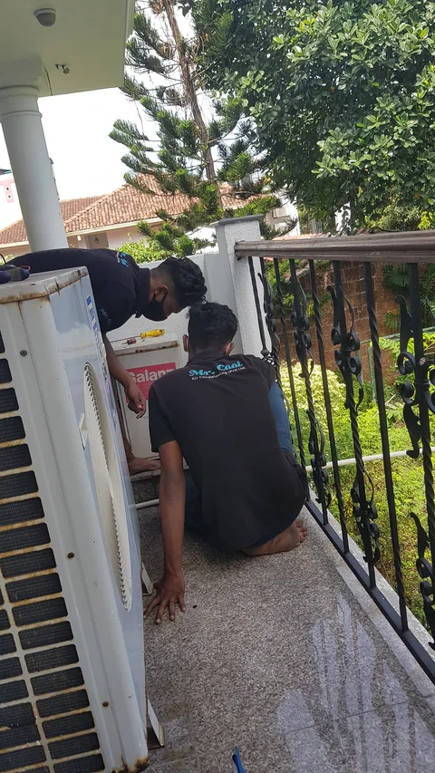
While the air conditioning gets fixed, the day becomes a typography and layout clinic: sitemap work, slimmer privacy and legal text, darker and lighter pink tests, narrower reading columns, IMDB and Apple references, and constant effort to make the site easier on the eyes instead of merely bigger on the page.
Returning to Website Work and Adding a Sitemap
2:15 p.m.
(b)
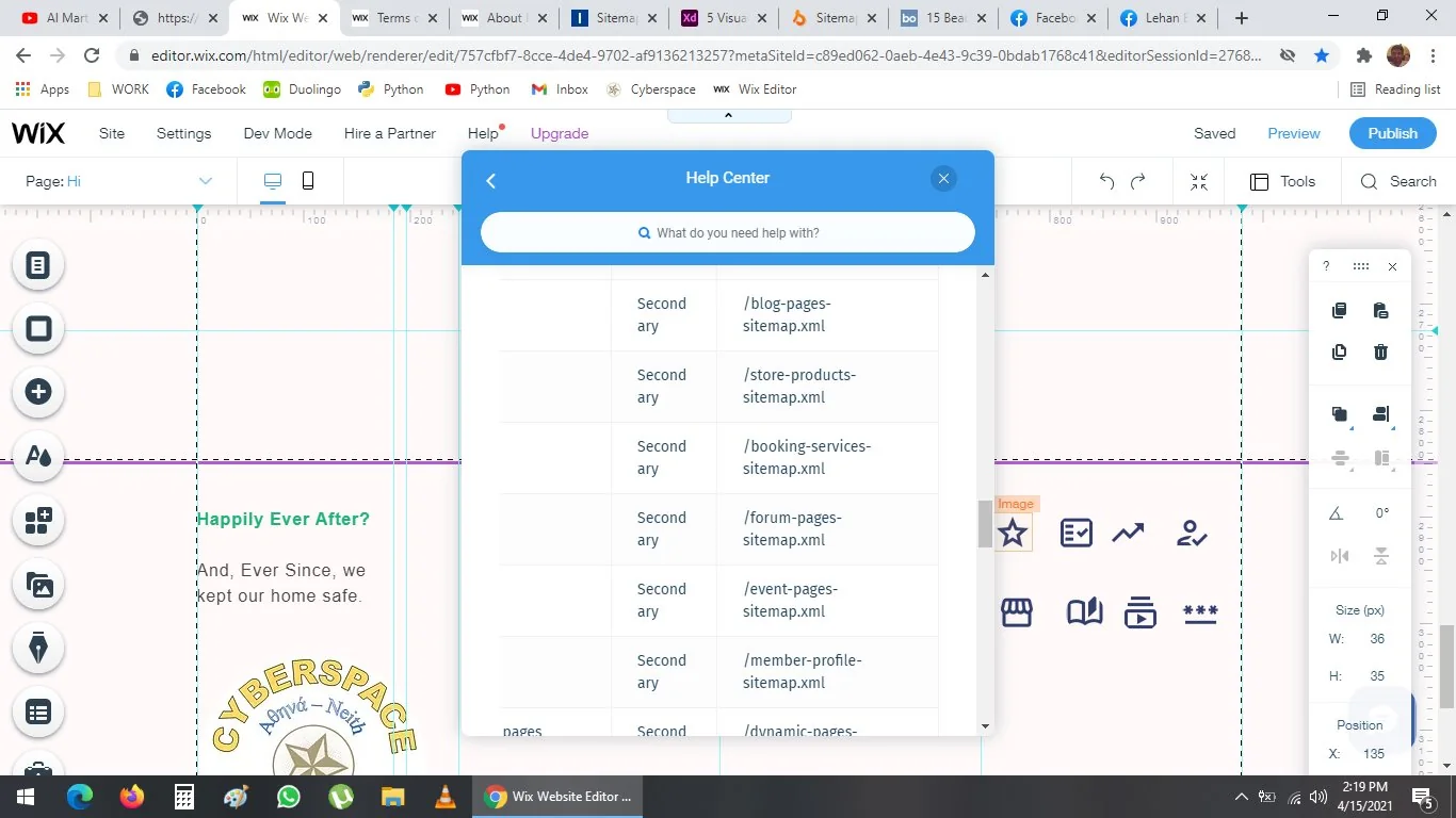
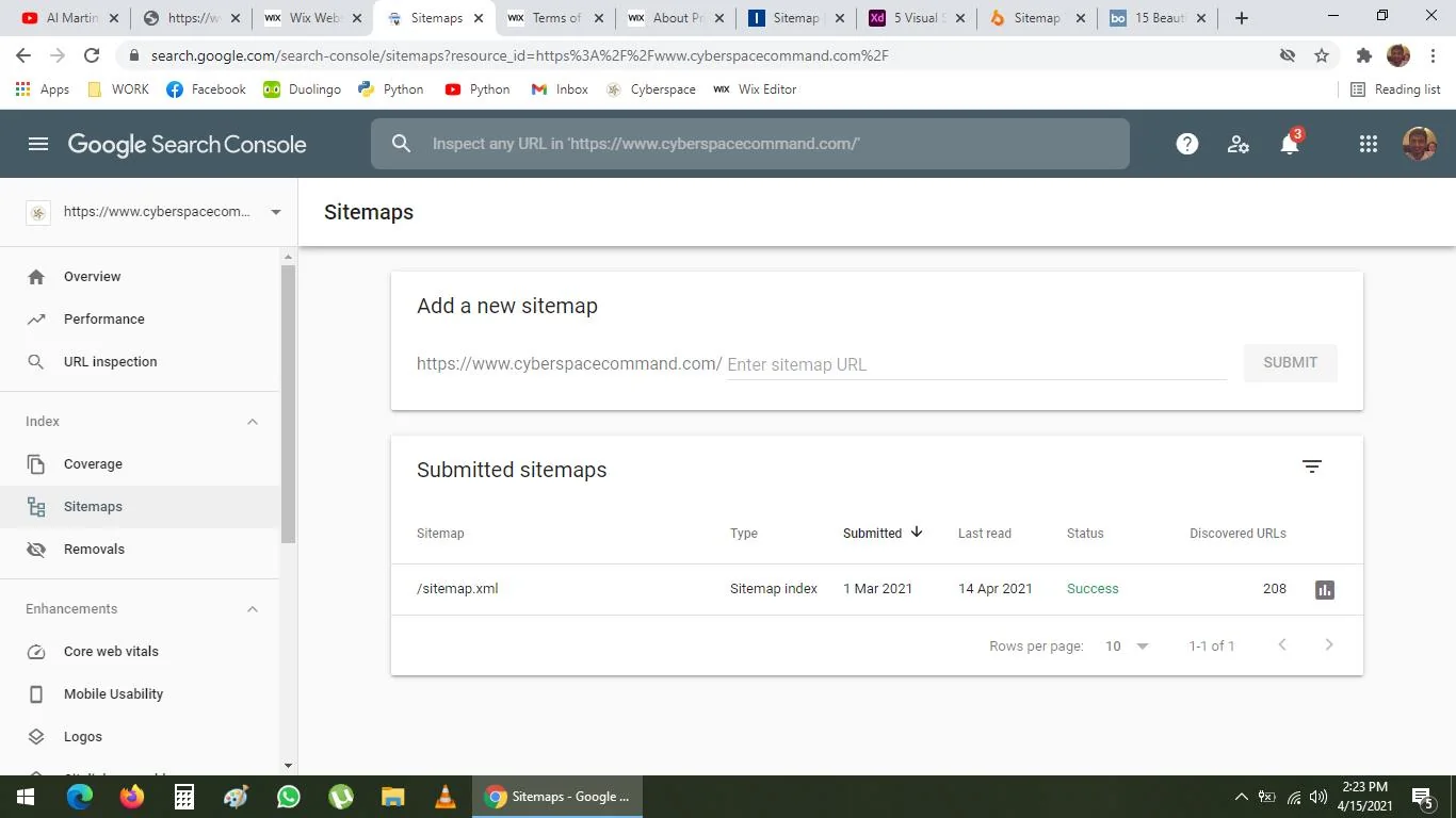
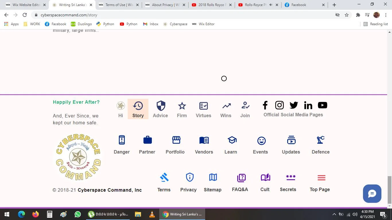
Okay, joking and theatrics aside, I will get back to work, I need to do a lot of work on my firm's website. I will add a site map.
https://www.cyberspacecommand.com/
and any of these html url slug links will display sitemap,
such as Main Pages
/sitemap.xml
Secondary Pages
/pages-sitemap.xml
Reformatting Terms and Legal for Easier Reading
6:30 p.m.
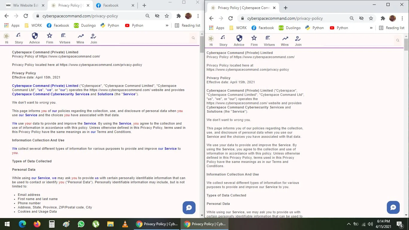
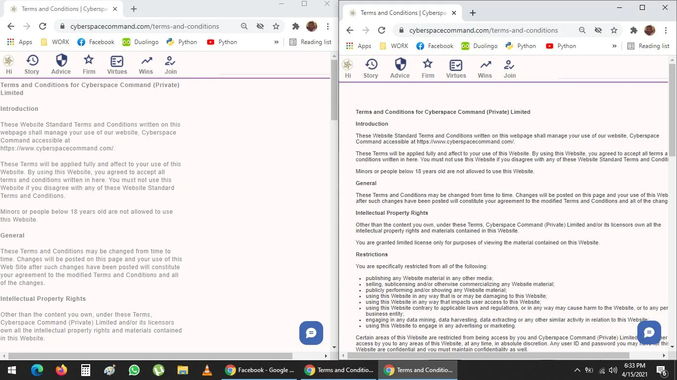
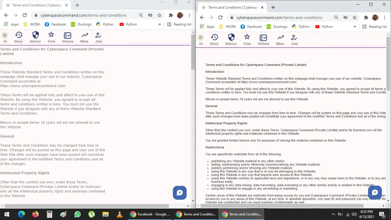
I reformatted Terms & Legal section of my firm's website, so it is narrow line text, which is easier to read, I also increased line spacing to 1.4 optimal and character spacing (leading or kerning) to 1.05 --
and of course, changed colour of background, foreground* and text to dark or lighter grey
Why Narrow Text Columns Are Easier on the Eyes
6:30 p.m.
(b)
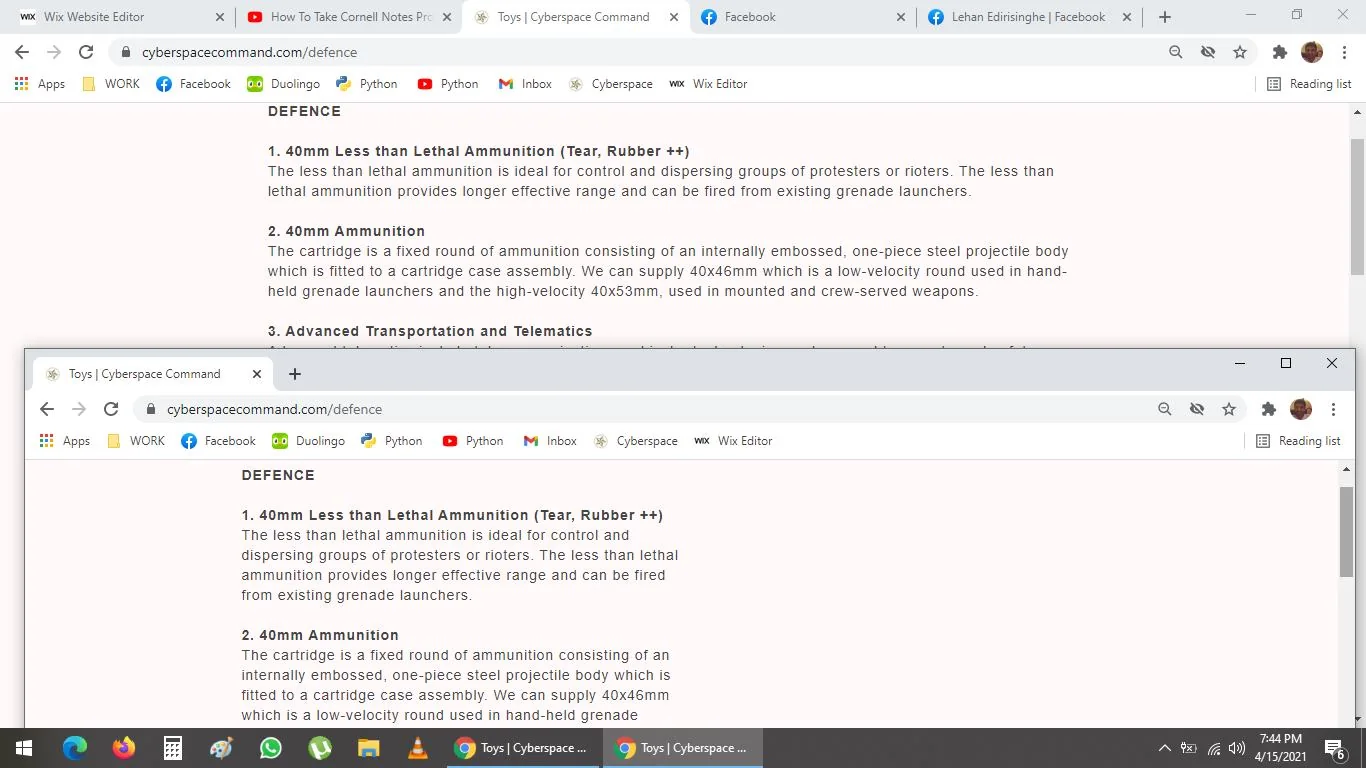
If I am reading the one on left, my eye is less stressed out, because, I do not have to look left to right with my eyeball, cornea or retina--
If you read the one on the right, the previous version, you have to slowly track the line all the way from the left side to the right hand side--
Despite the temptation to maximise use of space, because a desktop window is widescreen, it is wrong.
Rejecting a Darker Pink Background Despite Research
6:45 p.m.
Decisions, decisions, decisions--
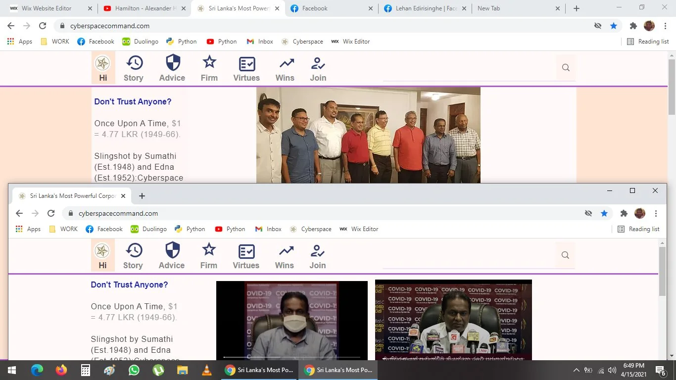
I dunno if I like this one with a different, darker shade of pink background or not.
I personally do not like it. However, research suggests, if you have a darker shade background--
it draws attention to the foreground window contents.
Though, I just do not like it -- so, I will not do it.
I might, later, make it a slightly darker shade of pink
and manually modify the window settings, so it is a slightly wider strip

Choosing a 33-Pixel Strip in Honour of Jacques
7:15 p.m.
(c)
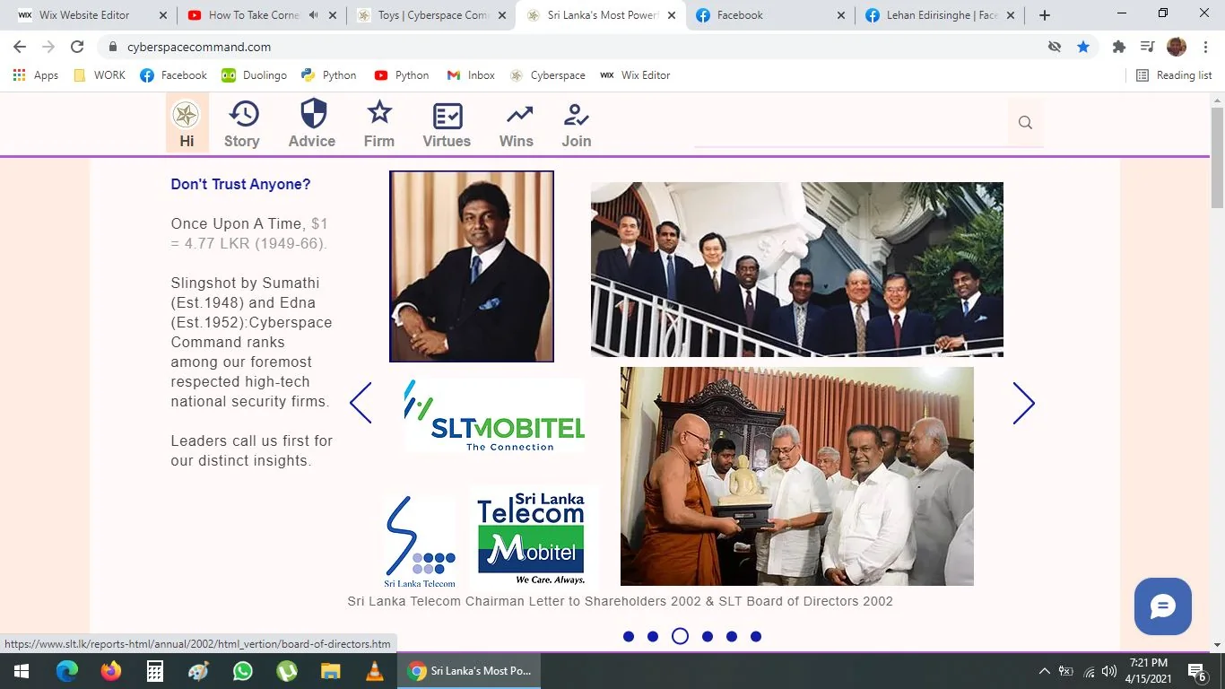
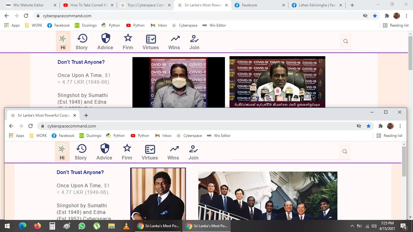
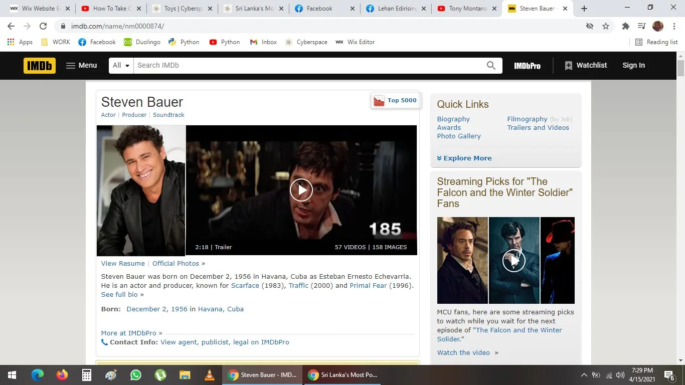
I am more comforted by this. The one on top is 69 px, and the one on bottom is 33 px.
In honour of Jacques Huyghebaert, who put all of this s*** together (Tony Montana), and therefore, who I trust, being a 33rd degree Freemason--
the only one in SL, I will make it 33 px.
Narrowing Website Text Until It Breaks Through the Footer
7:30 p.m.
(b)
I am manually making everything on our website a narrow column of text.
I did not understand then, but I faintly, but surely recollect, some websites i visited, especially blogs--
they also have narrow lines of texts.
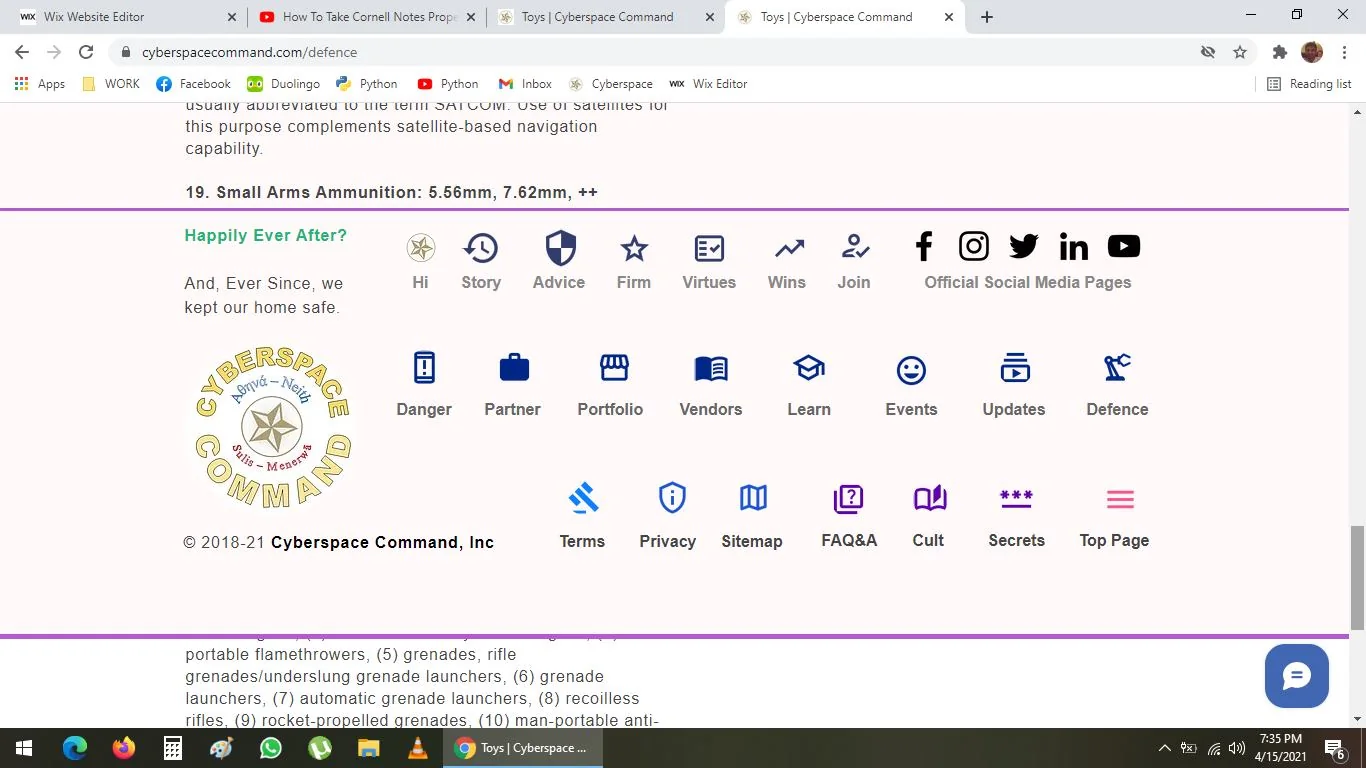
I have narrowed the defence section, the text blew up the footer somehow
Dunno wtf happened lol
Cannot believe the f***ing thing went past and through the footer--
like a real Howitzer/ Kalla Tuwaku
Explaining How Text Overshot the Wix Footer
7:45 p.m.
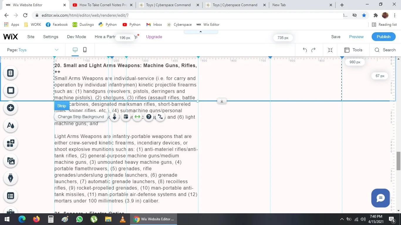
This text, it was inside the Wix strip, when I modified it, it somehow overshot and splash damaged through the slip and past the footer
in the previous screenshot, you can see, the difference between top and below the footer, which is below footer is white, above footer is very light pink: Snow White which I use
Narrowing Text, Eye Strain and the Cornell Note Method
7:45 p.m.
(b)
As mentioned, I narrowed the text.
Now, I may insert pictures in the right hand side, also, I dunno what ever the f*** --
My eyes are starting to ache now.
I should get food, rest and maybe do 10 mins on elliptical machine --
this reminds me of the Cornell Method of note taking, which I used to use in university of Leicester.
It respects the audience or viewer or user, as you show what is important in a pleasing, less stressful way
Pausing Website Work After a Subtle Contrast Change
9:00 p.m.
Now I am actually starving.
I will pause my wicked work to rest.
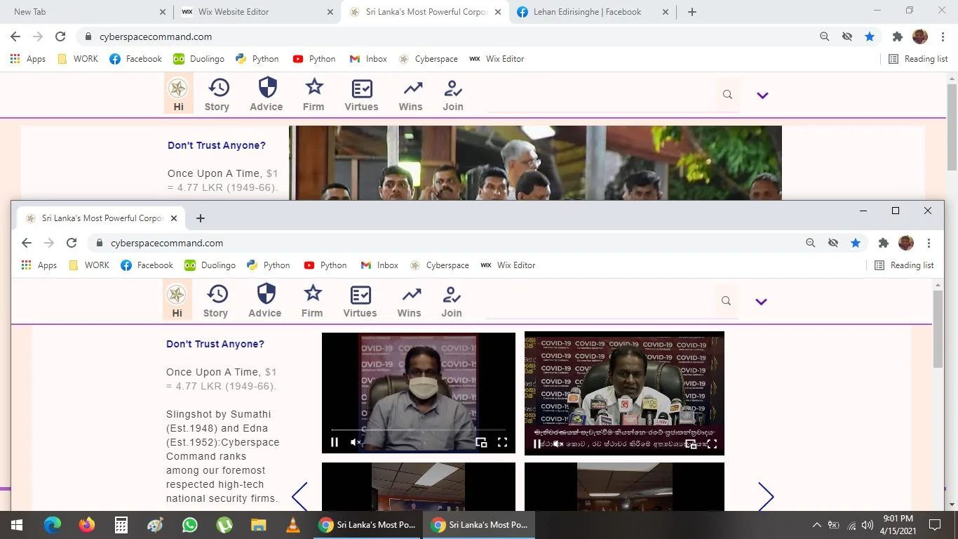
I made a slight, inconspicuous design change--
just like Apple.com or FB, I made slight contrast edits for the Wix Strip
It looks a little bit more polished
The beauty is in the details--
or the Devil
Let us find Beauty there, Wisdom and Strength to share:
G-d bless Freemasonry!
██████████████████████
███████████████████
██████████████████████████
█████████████████████████
█████████████████████████████
███████████████████
██████████████████████
██████████████████████████
███████████████████
███████████████████
███████████████████
███████████████████
██████████████████
██████████████████████████
██████████████████████████
███████████████████
███████████████████
███████████████████████
███████████████████████
███████████████████
Quoting Cortana on Master Chief’s Luck
Cortana:
"They let me pick. Did I ever tell you that? Choose which ever Spartan I wanted. You know me. I did my research, watched as you became the soldier we needed you to be. But you had something they didn't, something no one saw but me. Can you guess? Luck."
Names on this page
1 matched name linked to the Names index.

