Making the Site Simpler and Hiding Easter Eggs in the Art
ஏப்ரல் 9, 2021
A design-heavy page about making the website beautiful through white space, smaller sections, better image loading, and less visual stress. The most revealing move is playful: hiding invisible Easter eggs inside the artwork while imagining a bigger 'Before Lehan' and 'With Lehan' story for Sri Lanka.
Using White Space to Reduce Reader Stress
8:30 p.m.
(b)
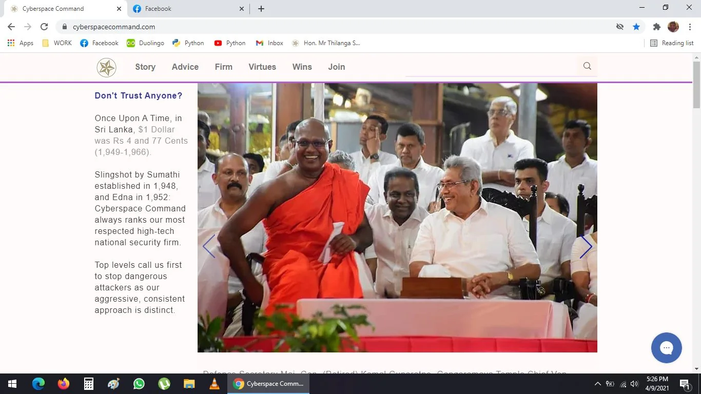
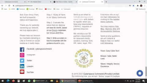
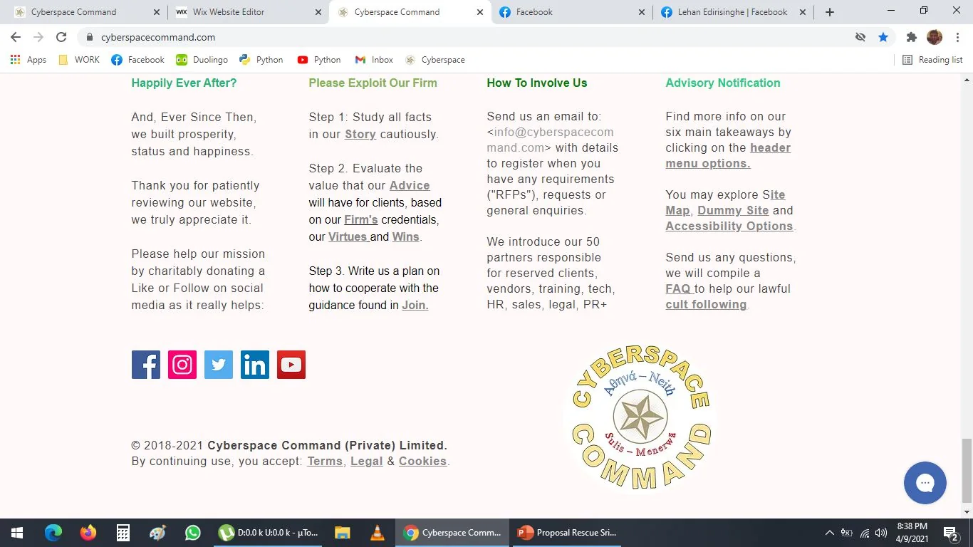
This is much better.
More white/ blank space = less stress.
The user, he or she suffers micro trauma, when he or she is reading through our website --
the less info, the less stress, the more successful we will be because the user will be happy
Even in this case, I could remove the logo, but I keep it just to help the user
The golden pentagram/ pentacle is first thing user sees, and it is last thing on site
The logo might be like 50 kb, it is not a big deal
Hidden Symbols in Grandma’s Painting and a Website Easter Egg
9:00 p.m.
I love to do this.
I put so many hidden stuff in my grandma's painting:
i. The 666 sign on her forehead as she has a scar
ii. I put a stupa or Buddhist temple building around her head, in the shape of a Prabhashvara/ Buddha's light aura to wish her on her journey to Nirvana
iii. The Kandyan Blue saree has deep meanings
iv. I made her a few shades whiter
v. I did some other things, I cannot remember
vi. Dharma Chakra gold pendant necklace
vii. Number of lines on her chair was intentional
***
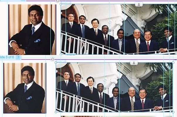
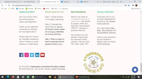
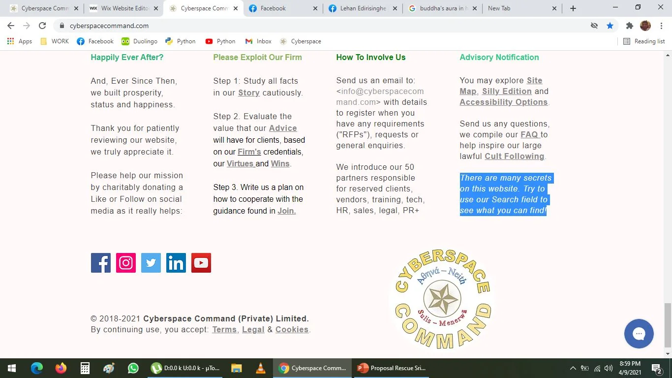
In our website, I added this Easter Egg:
Soo cool!
This is not visible, it is the Snow White white colour, so it is not visible, but if you select it, you see it
Names on this page
1 matched name linked to the Names index.

